Portuguese solar resource assessments up to twice as uncertain as rest of W. Europe
December 2018
Accurate solar resource assessments are essential to project a PV plant’s energy production – and ultimately forecast its revenue. So why are Portuguese energy yield assessments so contested? Our solar team got stuck into the data…
Solar resource assessments are the bedrock of the ‘Revenue’ line in PV financial models. In today’s competitive financing environment, the assumptions underlying solar resource assessment often have make-or-break impact on project valuations. It’s critical that investors trust the numbers provided.
To quantify solar resource, industry typically compares different irradiation databases derived from multiple physical sources – whether measurements or satellite images. There is always some level of scatter; in Western Europe this is often around 3%, after excluding outliers.
But something mysterious is happening with solar resource data in Portugal. We’re uncovered some surprising results. In some locations, scatter exceeds 6%. Take Castro Verde in the Alentejo region as an example: the Meteonorm database suggests solar irradiation of 1,913kWh/m², whereas SolarGIS gives 1,786kWh/m².
A difference of more than 100kWh/m² per year is hardly acceptable to an investor. So the Everoze team got on the case. We undertook detailed analysis on global horizontal irradiation – informed by multiple data sources, including on-site measurements and satellite-derived data in different regions in Portugal.
Establishing trusted sources
Our first step was to qualify our trusted data sources. We sifted through measurement campaigns from multiple solar projects and public institutions. Throughout we set the bar high: scrutinising equipment and procedures carefully and filtering out all datasets that offered less than a year of data.
We then compared this data with the satellite-based reference dataset. Our data analytics approach was to adopt a diligent day-to-day comparison of multiple data sources rather than a correlation of one dataset against another. This enabled us to detect abrupt changes due to change in methodology or equipment as well as long-term changes.
Even in the measurement campaigns that we qualified as trusted, we observed some ugly abrupt changes in the daily comparison with the reference dataset. See the figure below as an example: it shows a striking 7% step in the comparison between measured and reference dataset – most likely due to a change in the measurement equipment. We carefully disregarded periods with erroneous measurements.
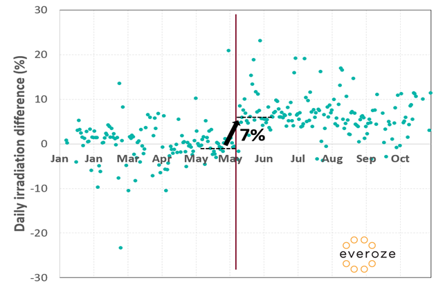
Ugly step change: New equipment explains a 7% jump
The result – lower scatter, improved investor confidence
We’ve categorised our results in regions, classified based on the difference in annual irradiation between different databases. See the ‘Before’ and ‘After’ in our Figure below. Erroneous measurements which presumably represent the basis for several databases leading to increased scattering are filtered out in an analytical procedure in order to reduce uncertainty – and ultimately boost investor confidence in energy yield assessments.
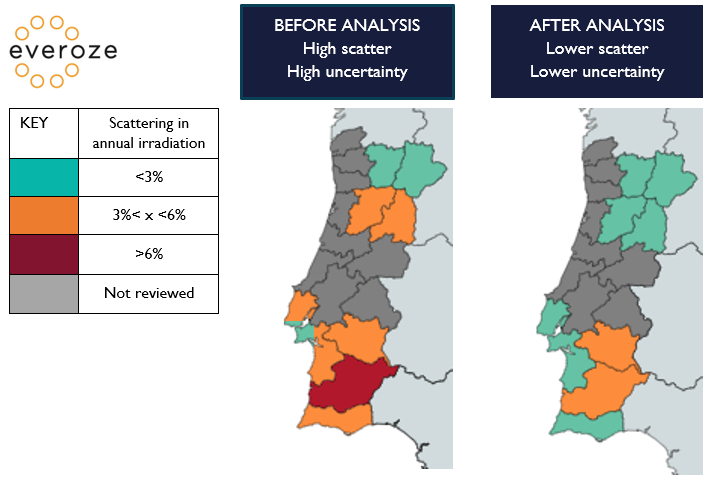
Before and after: Everoze’s approach pushes down the uncertainty
Our analysis is ongoing – we still hold concerns around the accuracy of measured datasets for the areas marked orange. We’re now validating these measurements via side-by-side measurements with an independent sensor. In the interim, here are our takeaways:
- Review energy yield projections especially carefully: the most conservative and the most aggressive approaches vary by >6%.
- Scrutinise data sources: quality is variable; assertively cut out those that don’t make the grade.
- Avoid simplistic averages: averaging annual values from different databases may lead to significant error.
We continue to optimise our approach for Portugal – get in touch with Everoze partner Stefan Mau if you’d like to know more.

